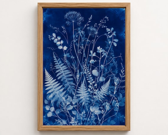
A focal point by the reading chair
Compare a 16 × 20 in print, 40.6 × 50.8 cm before framing, on the wall beside your chair. Let it sit in the same visual area as the chair and side table, rather than centring it on the entire wall.
A deep blue artwork can be the thread that connects a reading chair, a cushion and a shelf of well-loved books. Here, fern silhouettes and flower studies share an inky palette while keeping their own shapes and rhythms.
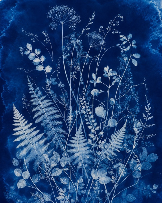
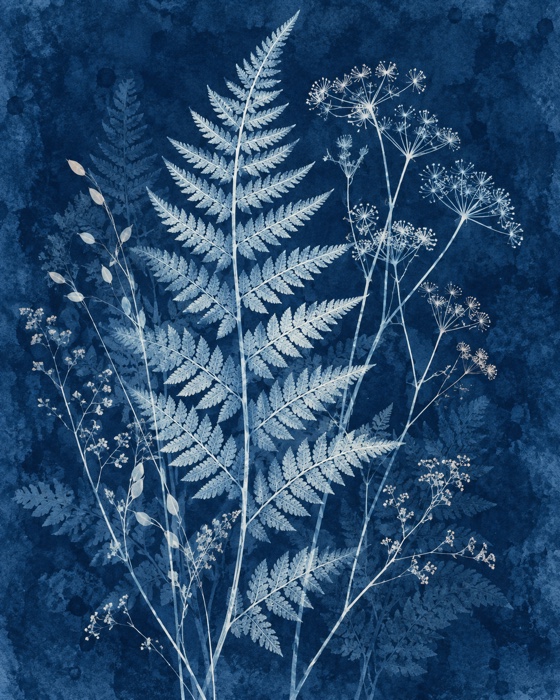
Compare a 16 × 20 in print, 40.6 × 50.8 cm before framing, on the wall beside your chair. Let it sit in the same visual area as the chair and side table, rather than centring it on the entire wall.
Try two 16 × 20 in prints with a 3 in gap. Together they span 35 in (88.9 cm) before frames. Mark the complete arrangement first, then view it from your usual seat. The illustration shows a pairing idea, not a room measured to scale.
Sizes describe the artwork only. Frame dimensions and the available size/finish combinations vary; check the individual Etsy listing before ordering.
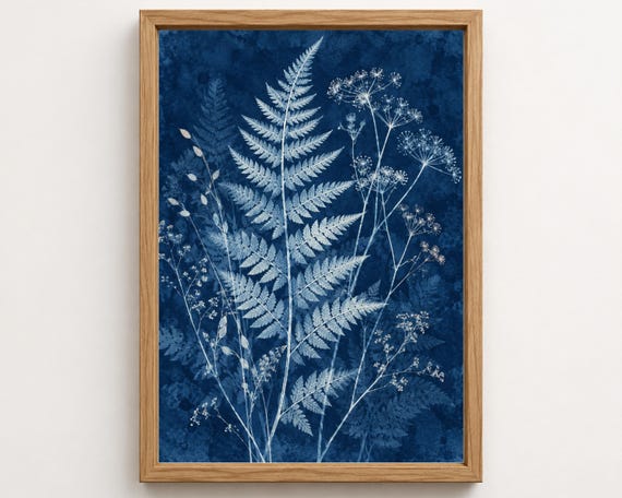

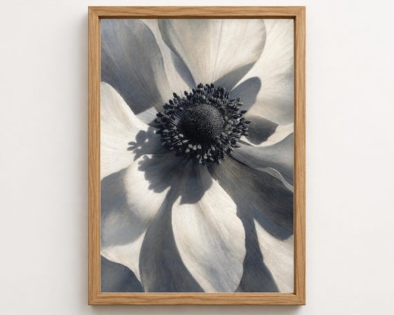

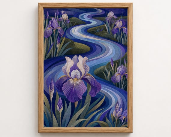

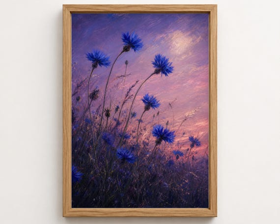

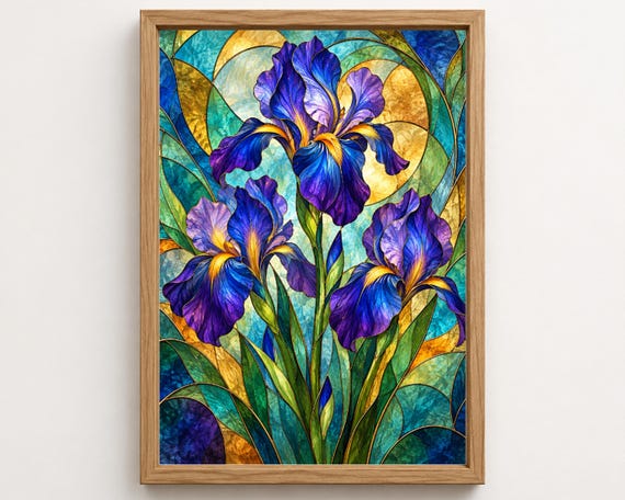

Pair a delicate fern with a bolder flower study. Keep the frames consistent and pick up a small amount of the blue elsewhere in the room. Pale walls and natural wood give the darker artwork breathing space.
No. Shared light and dark tones can connect different blues. Compare the actual artwork images together, and keep one other element consistent, such as frame colour or the amount of white around each print.